They all usually involve either - the artwork/images featured on the front cover of the album, or have the main artist themselves on it: using direct mode of address by looking into the camera.
They all evidently include the name of the album and the date of release and adopt an appropriate colour scheme depending on the genre and visual aesthetic of the artist.
In my previous blog post, I analysed the various magazine advertisements for the album "Danger Days: The True Lives Of The Fabulous Killjoys" by 'My Chemical Romance' and explained that the bright colour palette seen on those advertisements highlighted a key change in visual image for the band.

Hence why I want to compare it to the advertisement seen at the top of this post. The album prior to "Danger Days" was titled "The Black Parade" - its main theme was death and was a much darker record for the band; but was also one that some people consider their best. The deeper theme of the album required a darker colour scheme of black and white to match the concept of 'the black parade'. The poster merely shows the artwork of the front cover of the digipak - which is the skeleton marching, whilst dressed in its black parade uniform. The name of the band is written in large font above the image, and below the title of the record and release date are shown. It's very simplistic - allowing the artwork and colour scheme to take powerful hold and draw an audience in.
The next magazine advertisement follows the same conventions once again;
 This magazine advertisement is for the album "Hesitant Alien" by 'Gerard Way', who was the lead singer of 'My Chemical Romance' and released a solo record in 2014 following the band's split one year before. This album was significant for Gerard who was stepping away from his band and trying to show a different side to his musical capabilities. He follows through with the bright colour scheme seen in MCR's last album - but it is much more personal to him as a solo artist; it's his form of self-expression. It follows the conventions of most digipak magazine advertisements by; being simplistic, including the album artwork, the name of the artist and release information - as well as a specific colour palette.
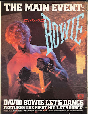
Lastly, I decided to include a magazine advertisement for David Bowie - merely to emphasise that the codes and conventions of magazine advertisements have remained the same, even from music released in the 80's.
Evidently, the colour scheme that Bowie adopts is much brighter; it's more eccentric and eye-catching then the other two advertisements seen in this post. Yet every advertisement will have a colour scheme specific to the aesthetic of the artist.
This is because these posters within these magazines are - as their title says - advertisements. They are marketing tools to draw in current audiences and potential new ones in the hope of creating consumer loyalty. They also help to provide artists with a recognisable brand identity. Something as simple as a colour palette, or a logo in the corner of the poster may become the motif of an artist's image - and may well be the first thing fans look for when following their favourite artists.

No comments:
Post a Comment